The competitive landscape in the energy drink space has a certain vibe: harsh blacks and reds, traditionally team-ish, and SUPER MANLY.
With the client’s almost exclusive female customer base, we had to ask: how can we appeal to loyal fans, while leaving the door enticingly open to a new demographic?
We took a playful approach, contextualizing ZipBOOM’s unique combination of benefits and superior ingredients through the lens of kinetic color, immersive photography, and all the electric feels. It’s more than an energy drink – it’s an energized drink.
By leveraging bold colors, vivid imagery, and energetic messaging, we built a vibrant identity that embodies the clear focus and power of ZipBOOM. We wanted to help you FEEL the way the product makes you feel, before you’ve even had a chance to taste it. By they way, it’s delicious.
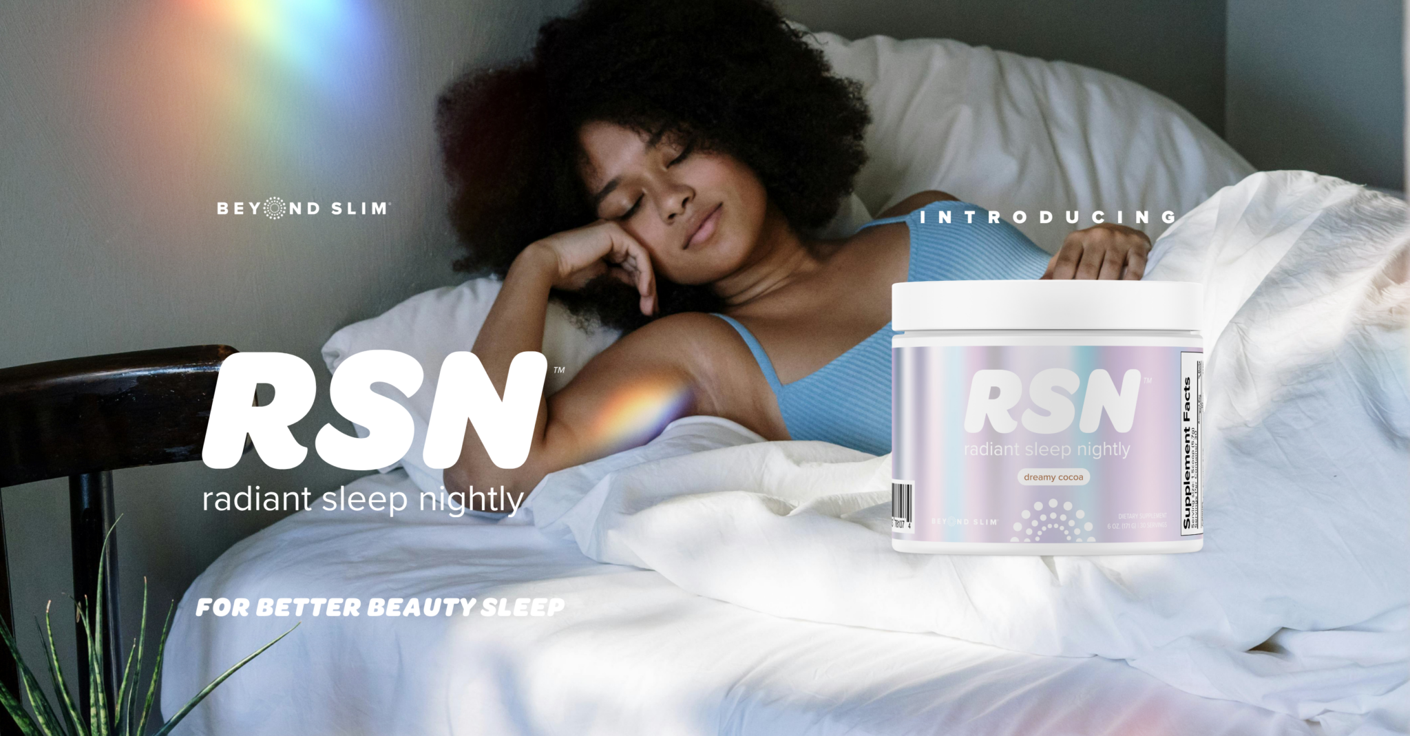
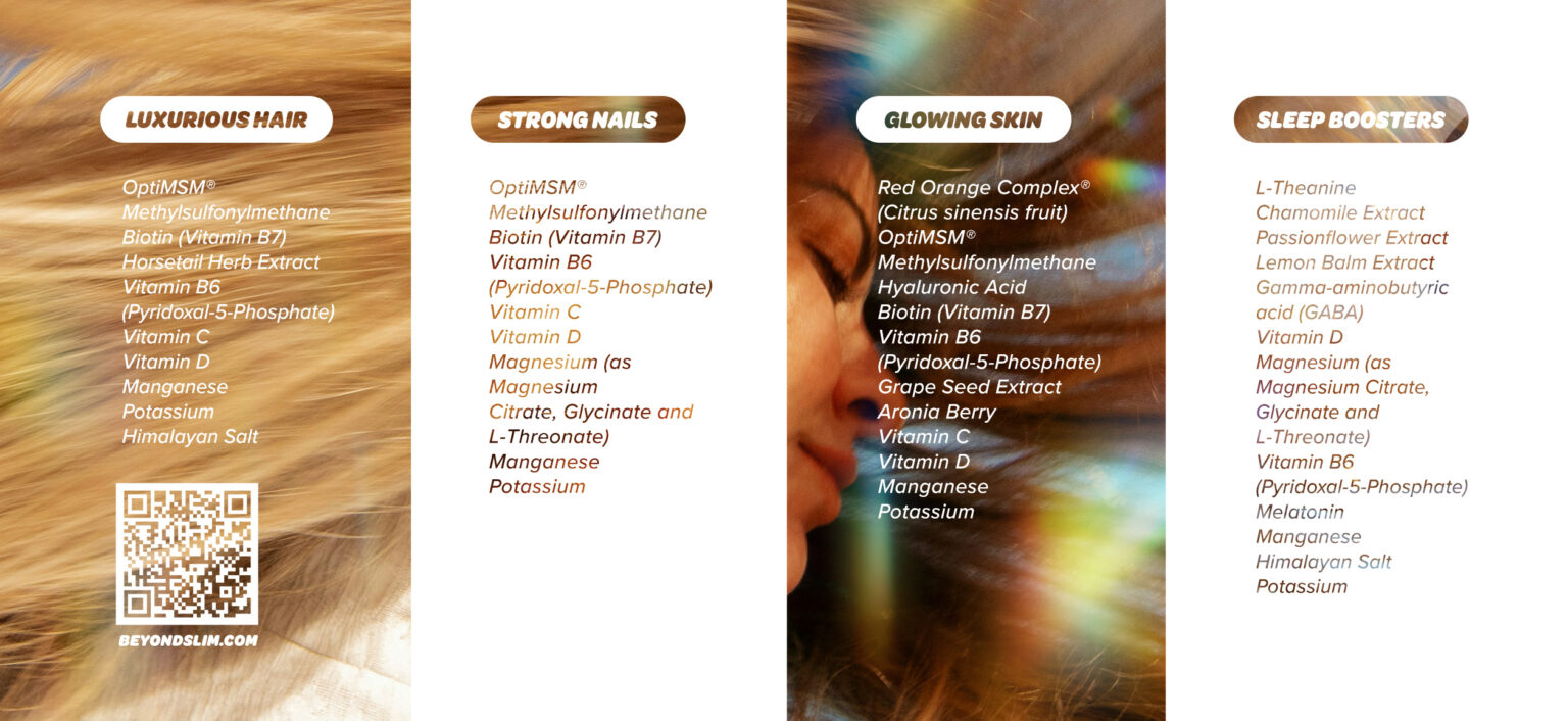
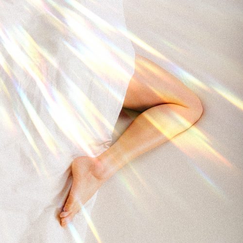
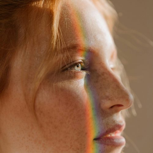
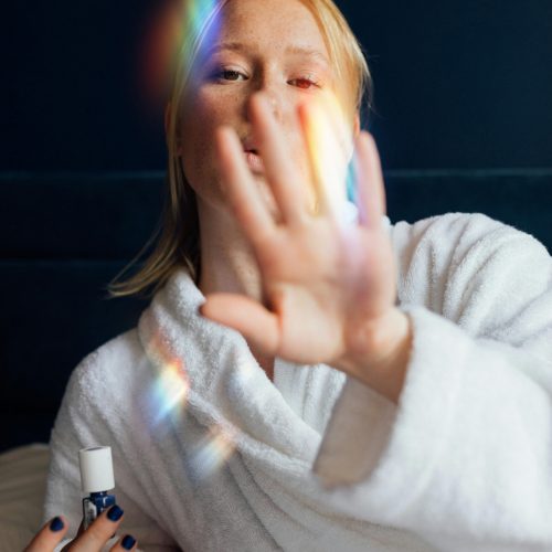
Better Beauty Sleep
No wonder Sleeping Beauty looked so good...

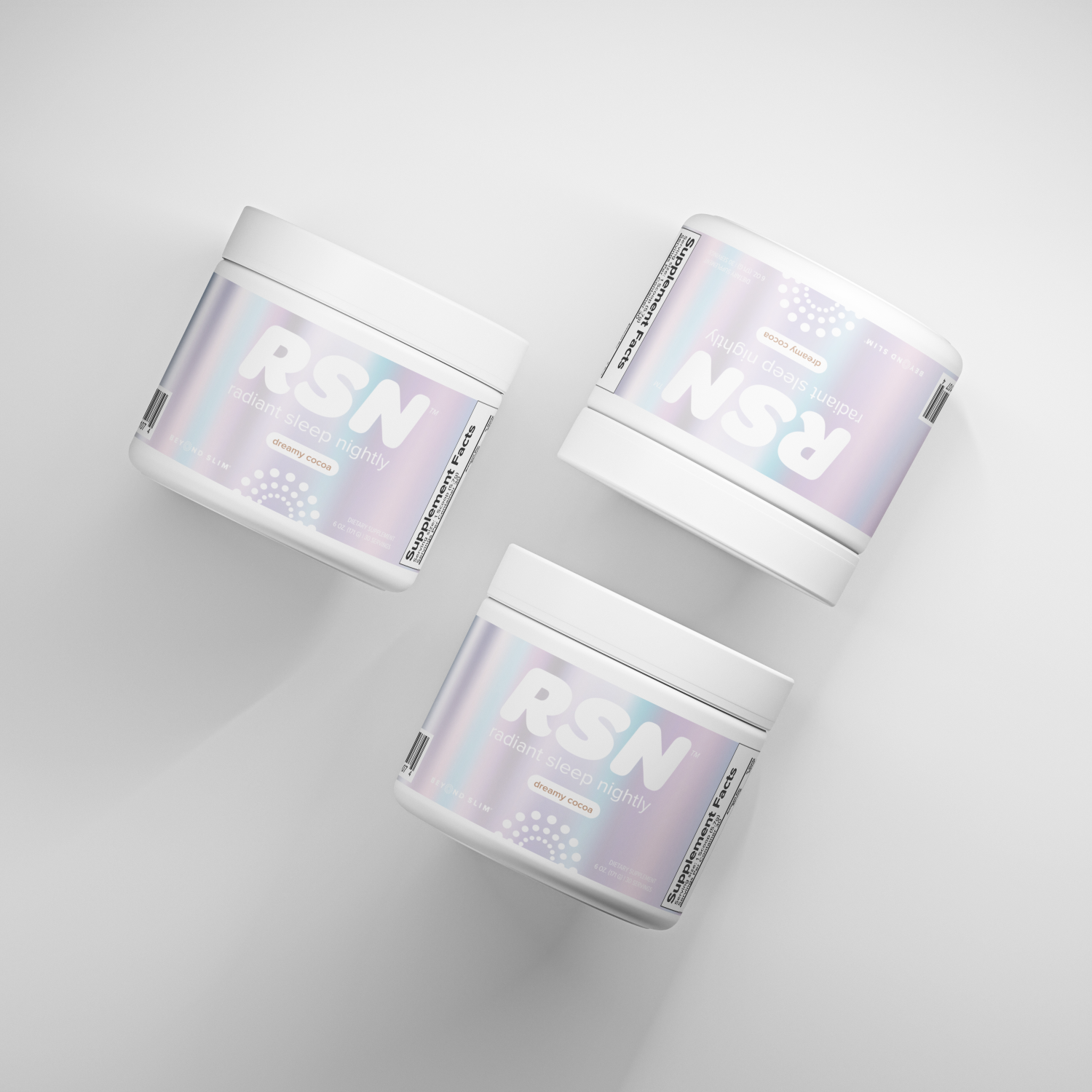
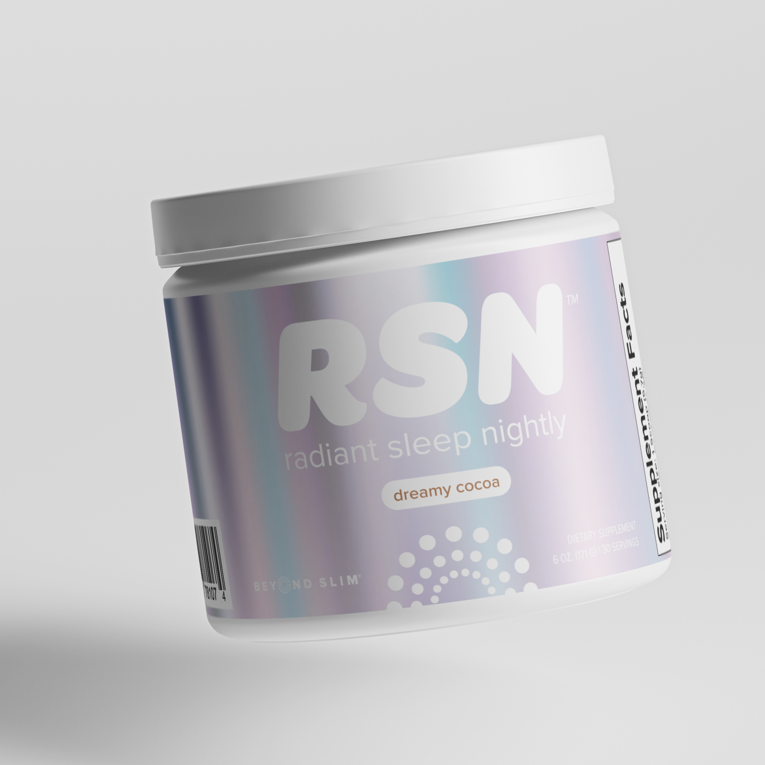
Project management at its best. Over 150 Asana tasks, more than 100 social assets, and 40 (FORTY!) label variations. A marketing communications plan executed to a T. 1 multi-(iPhone)camera launch video. With an established identity in place, we orchestrated an extensive month-long launch of RSN, collaborating with multiple partners and key stakeholders to execute across all channels. BEAUTY REST WELL EARNED….