Color isn’t just aesthetic—it’s emotional. And in branding, emotions = conversions.
Before your dream client even reads your headline or hears your pitch, they’ve already made a snap judgment. That judgment? Up to 90% influenced by your brand’s color palette (thanks, Institute for Color Research). So if your palette’s purely personal—or a mix of Pinterest moods—it might be time for a strategic glow-up.Why Color Psychology in Branding Matters
Color psychology in branding studies how color influences perception and behavior. In plain terms? The right hues make people trust, remember, and buy from you.
Strategic color choices:
-
Build instant trust with new audiences
-
Trigger emotional buying behaviors
-
Make your brand look premium—or playful
-
Increase brand recall (aka the “Oh, I know that brand!” effect)
This isn’t fluff. This is foundational.
Emotional Marketing Colors: What Each Hue Signals
Let’s break it down by industry. Notice how color helps these brands connect and convert:
Quick-Serve Restaurants
McDonald’s, In-N-Out, Chick-fil-A = red and yellow for hunger and urgency. Sweetgreen flips the script with greens and neutrals to signal health and mindfulness. Taco Bell leans into purple—bold, fun, rebellious.Health & Wellness:
Seed, Oura, Ritual use soft pastels and neutrals to say “pure, calm, science-backed.”
Calm and Headspace = blues and peaches that lower stress on sight.
Golde = warm pinks and yellows for joy and glow-from-within vibes.
Fashion
Chanel and Prada = black and neutrals that whisper power and sophistication.
Parade = bright, electric hues for unfiltered self-expression.
SKIMS = inclusive neutrals that redefine “nude” with purpose.
Interior & Lifestyle
Erewhon and Parachute Home = warm neutrals for that aspirational calm.
Glossier = soft pink that’s iconic, minimal, inclusive.
Aesop = amber and charcoal for apothecary-level luxury.
Branding Color Palette Tips from the Pros
Start with strategy, not style.
Your colors should reflect how you want people to feel—not just what you like.
Audit your industry. Then zig.
Know the norms, then stand out with intentional contrast.
Don’t guess the psychology.
Red = passion, urgency
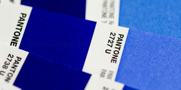
Blue = trust, calm
Yellow = joy, clarity
Green = health, growth
Black = elegance, authority
Neutrals = simplicity, sophistication
Design for consistency.
From your website to your packaging to your social feed—keep your palette cohesive.
Use contrast to guide action.
Bold accent colors = higher click-throughs, better engagement.
Want to Stay on Trend?
Need the full breakdown of 2025 color trends?
Check out our Brand Glow-Up Workbook for a peek at palettes that are popping right now—plus a step-by-step guide to uncovering your brand’s true visual vibe.
Build a Brand That Feels as Good as It Looks
At JLA, we’ve helped brands like Earthbar, Pure Vitality, and ZipBOOM™ craft visual identities that feel aligned and perform like pros.
Ready to find your signature palette?
Because your brand shouldn’t just be seen—it should be felt.