How Design Psychology Drives Conversions (Without Anyone Realizing It)
In just 0.05 seconds your homepage sparks a gut-level “stay or bounce” decision (CXL). That blink-fast judgment happens before a single headline is read, which means visual cues — not copy — steer the sale. Below is your crash course on design psychology in marketing (sprinkled with juicy stats and swipe-worthy tips) so you can make every pixel pay rent.
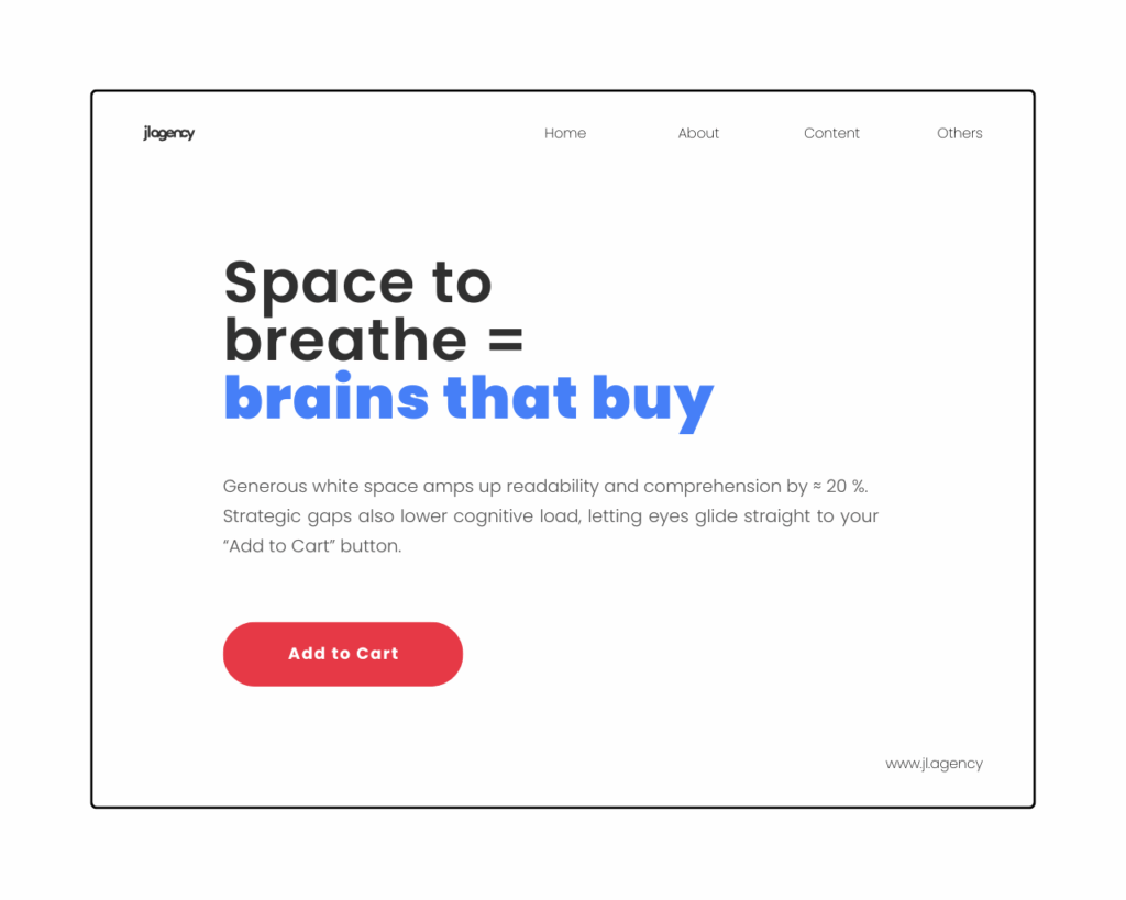
1. Space to breathe = brains that buy
Generous white space amps up readability and comprehension by ≈ 20 % (HubSpot Blog).
Strategic gaps also lower cognitive load, letting eyes glide straight to your “Add to Cart” button.
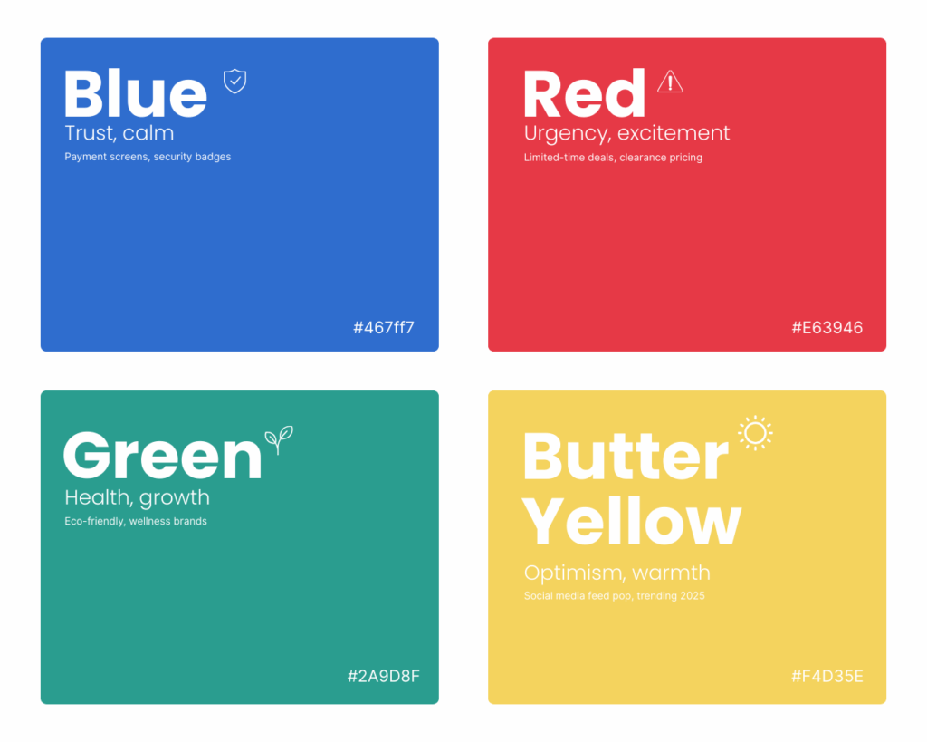
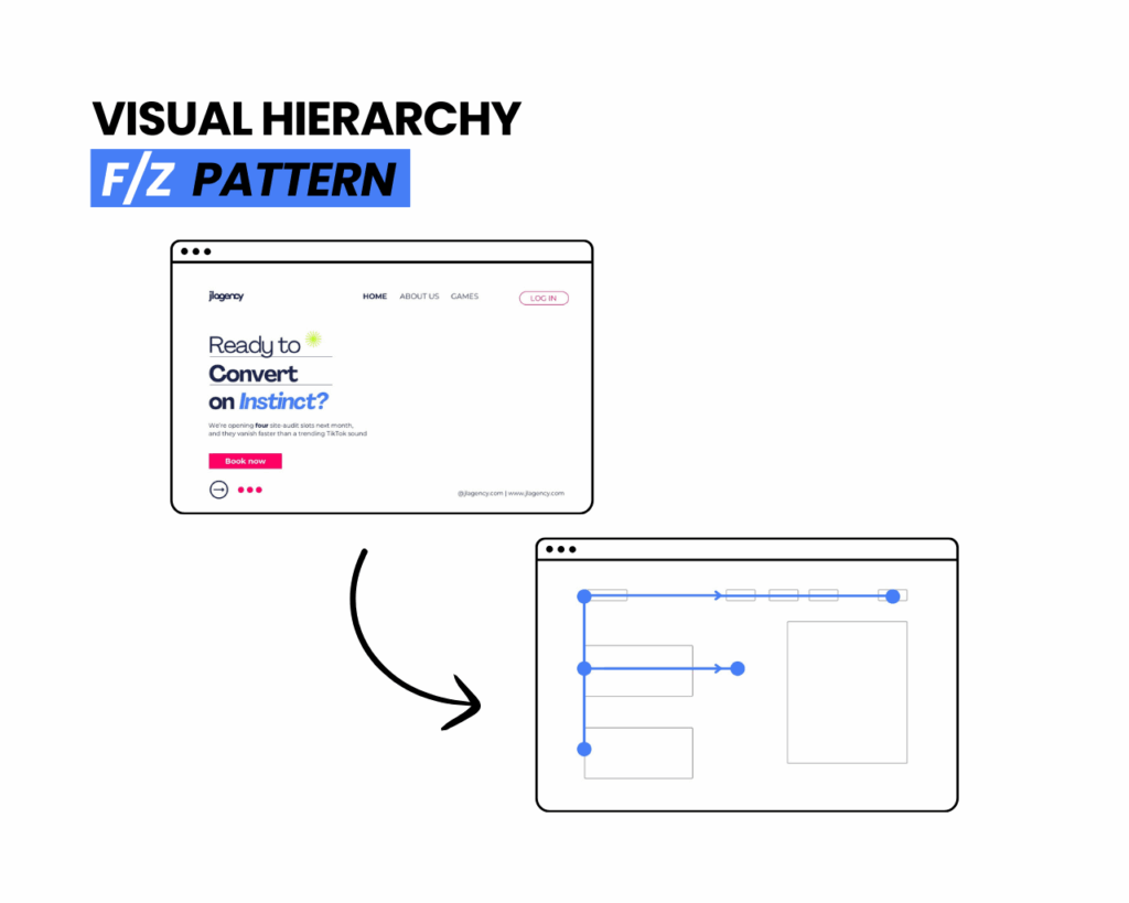
Humans scan in “F” or “Z” patterns. Layer sizes, contrast, and motion so eyes land on the one thing that matters—your CTA. Anchor that button in a high-contrast color (see above), give it breathing room, and keep the label action-packed (“Get My Demo” > “Submit”).
Design dollars print more dollars
Design-led brands outperformed the S&P 500 by ≈ 2.19× over 10 years (dmi.org).
Translation: aesthetics aren’t fluff—they’re a revenue engine.
Quick-fire UX tips (bookmark-worthy):
3-second rule: Can a stranger name your offer and next step in three seconds? If not, simplify.
Micro-animations: Hover states and subtle motion guide curiosity without overwhelming.
Accessibility wins: Contrast ratios ≥ 4.5:1 boost both inclusivity and SEO juice.
Social proof clusters: Position testimonials adjacent to key actions; cognitive bias does the heavy lifting.
SEO Power Moves:
Sprinkle long-tails like “conversion-focused branding” and “website UX tips” in headers and alt-text.
Keep your H1 under 60 characters (Google snippet-friendly).
Serve WebP images + lazy-loading to keep Core Web Vitals in the green.
Ready to Convert on Instinct?
We’re opening four site-audit slots next month, and they vanish faster than a trending TikTok sound. Snag your spot before the door clicks shut and discover the hidden tweaks that turn window-shoppers into raving fans.
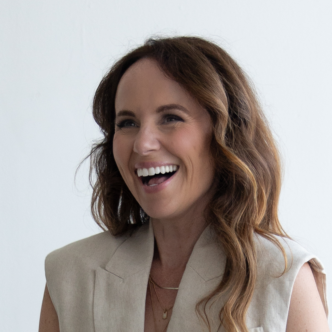
Founder and Head of Creative of JLAgency, Jennifer Laun is a brand strategist and creative director who helps wellness, lifestyle, and purpose-driven businesses find their edge—and look damn good doing it. She’s known for turning fuzzy ideas into scroll-stopping brands that sell with precision, style, and smarts.
Transparency is important to us! This article was written and/or designed with lots of assistance from our favorite AI tools.
Subscribers get first access to new worksheets + extras
Catch the Creative Current
Get juicy ideas + tactical tips in your inbox—swift, stylish, and actually useful.
Built for founders, marketers, and creatives. No fluff. No spam. Unsubscribe anytime.
Free Preview
Turn Your Brand From Meh to Magnetic—In One Afternoon
Drop your email below and we’ll forward the free version of our client workbook over to get your brand glowing!
Workbook view-only link. The editable, fill-in template is available separately. By submitting your information you agree to receive an occasional email from JLA. Built for founders, marketers, and creatives, the Creative Current contains: No fluff. No spam. Unsubscribe anytime.
Subscribers get first access to new worksheets + extras
Catch the Creative Current
Get juicy ideas + tactical tips in your inbox—swift, stylish, and actually useful.
You’ll be automatically redirected to your asset after you submit.
Built for founders, marketers, and creatives. No fluff. No spam. Unsubscribe anytime.