You know that friend who drops $$$ on a haircut… and shows up with dirty hair?
That’s what most founders do before a rebrand.
They invest in the visible stuff—logo, colors, fonts, a moodboard that could make a grown designer cry tears of joy—while the actual business signals are still fuzzy:
- the offer is unclear
- the audience keeps shifting
- the pricing feels awkward
- the customer experience doesn’t match the “premium” look you want to project
So the brand gets prettier.
And the business stays confusing.
Here’s the point of view we’ll defend all the way through this article:
A rebrand is not a makeover. It’s the visual proof of decisions you’ve already made.
If you haven’t made the decisions, design can’t save you.
The #1 mistake: treating visuals like the strategy
The biggest rebranding blunder is jumping straight into identity design before you’ve locked:
- Positioning: what you own (and what you refuse to compete on
- Audience clarity: who you’re for, and who you’re no
- Differentiation: the specific reason people choose you over alternatives
- Offer architecture: what you sell, how it ladders, and what it’s worth
- Experience alignment: what it feels like to buy from you at every touchpoint
When those pieces are missing, your new brand identity becomes… decoration.
Polished confusion. A cute outfit on the wrong person.
And in 2026? Confusion doesn’t just hurt conversion. It kills trust.
McKinsey has been saying some version of this for years: consistency and trust are core drivers of customer satisfaction, and they require leadership-level attention—not just marketing output. That’s the real rebrand work. (McKinsey on consistency)
Why this happens (and why it’s so tempting)
Because visuals feel like progress.
A new logo is tangible.
A brand strategy is… not. It’s decisions, tradeoffs, and uncomfortable clarity.
But here’s the trap: brands use a rebrand as a substitute for commitment.
They want the feeling of a new chapter without doing the work of writing it.
Design can amplify a clear direction. It cannot invent one.
Also: humans judge fast. Stanford’s web credibility research found that people heavily weight design when assessing credibility. That’s exactly why “pretty” without clarity is dangerous—it can create expectation you can’t fulfill. (Stanford Web Credibility Project)
What a rebrand is actually for (the adult reasons)
A real rebrand should do at least three things:
- Make buying easier
The right people instantly understand what you do, who it’s for, and why it’s worth it. - Make pricing make sense
Your brand signals the level you’re charging at—without a sales pitch. - Make internal decisions faster
Your team stops improvising tone, visuals, and messaging every week.
If you’re rebranding because “we’re bored with our look,” that’s not a rebrand. That’s a refresh.
If you’re rebranding because “we want to be seen differently,” now we’re talking—but only if the business has earned that shift.
McKinsey puts it bluntly: as channels and choices expand, trustworthiness matters more to consumers. Trust is built through coherent signals over time, not one shiny redesign. (McKinsey on the future of brand strategy)
The pre-rebrand game plan (do this before you touch color)
If you want a rebrand that sticks, run this in order.
1) Audit what’s already working (don’t redesign friction—solve it)
Ask:
- where are people hesitating?
- what gets saved/shared/replied to?
- what sells without convincing?
- what objections repeat?
If your rebrand doesn’t address the real friction points, you’ll just package the same problems more expensively.
If you need a framing mindset for this: future-proof brands optimize for recognition and trust, not constant novelty. (How to Future-Proof Your Brand for 2026 and Beyond)
2) Clarify your audience (specific is premium)
“Everyone” is not a strategy. It’s an avoidance tactic.
You need:
- the exact buyer you want more of
- what they’re trying to protect (status, time, certainty, identity)
- what they believe about your category
- what they’re tired of hearing
- This is where brand strategy becomes consumer psychology—because you’re not selling features. You’re selling a decision that feels safe.
3) Define differentiation that isn’t wallpaper
If your “unique” statement could be swapped onto five competitors, it’s not differentiation. It’s decor.
Try this operator test:
What do you do (or refuse to do) that forces a customer to choose you?
If the answer is vague, your rebrand will be vague too.
4) Align the whole experience (your brand is how it feels to buy)
Branding doesn’t end at the logo. Your brand is the emotional outcome of the experience:
- first click
- landing page clarity
- checkout flow
- packaging
- onboarding
- customer support tone
- retention and re-purchase cues
If the experience is messy, your new look becomes a promise you can’t keep.
This is why we love the “customer-meets-product” lens—because it pulls branding out of the abstract and into the real world. (Where Customers Meet Your Product First)
5) Only now: translate strategy into visuals
Here’s the clean order:
Positioning → messaging → experience rules → visual system
Not the other way around.
Because a brand identity isn’t art.
It’s a system designed to create recognition and reinforce meaning—consistently.
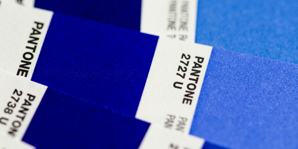
If you want a practical proof of this: color choices, for example, are only persuasive when they’re attached to strategy (emotion, category contrast, and consistency). (Brand Colors Aren’t Just Pretty — They’re Persuasive)
The glow-up that actually sticks
If you want the punchline in one sentence:
Don’t rebrand to become clear. Get clear, then rebrand to be seen correctly.
That’s how you avoid the most expensive mistake: spending money on aesthetics when what you needed was decisions.
Want a rebrand that performs (not just photographs well)?
Start with the strategy work that prevents do-overs, endless revisions, and “wait… this still doesn’t feel like us.”