Consumers have pattern-matched “clean and minimal” to “generic and manufactured.” Nobody sent a memo. It happened through saturation.
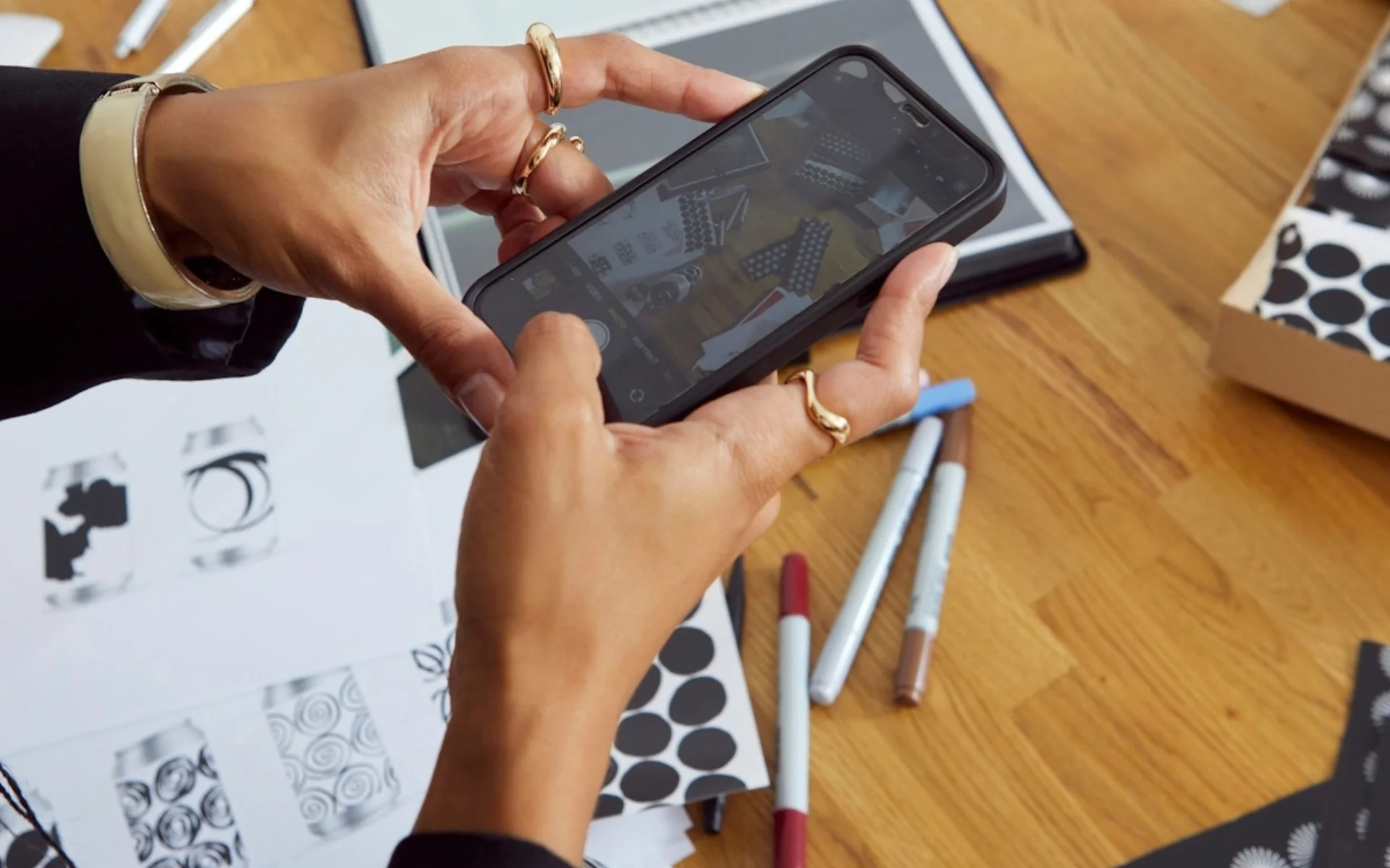
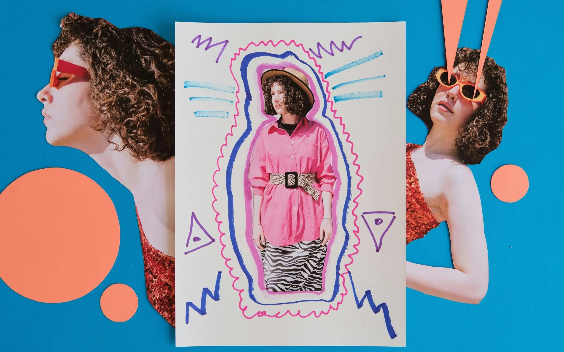
Walk through any natural grocery, open any DTC brand’s Instagram, look at what’s winning packaging awards in 2026: grain is back. Visible texture, hand-stamped type that doesn’t quite sit straight, scrapbook layouts, zine aesthetics.
Canva’s 2026 design trends report declared this the year of “Imperfect by Design.” The Branding Journal and Creative Bloq put tactile, raw aesthetics at the center of where visual identity is heading. Design publications are unanimous.
Most coverage stops at identification. It’s trending. Here are examples. Here’s how to achieve the look.
That framing misses the strategic logic underneath. Understanding why this trend is happening tells you something far more useful: whether it belongs on your brand, and what it will cost you if you get that call wrong.
Why “Clean and Minimal” Lost Its Trust Signal
For most of the 2010s, clean and minimal was shorthand for credible. A sans-serif wordmark, a white-space-heavy layout, a muted color palette. These read as considered, premium, and trustworthy.
Consumers learned to read those cues. Then they learned that any brand could purchase them.
The same Squarespace template. The same clean packaging aesthetic from a stock mockup. The same beige color palette appearing on skincare, supplements, baby products, and snack brands at the same time. Clean and minimal stopped communicating “intentionally designed” and started communicating “someone followed the template.”
When enough brands use the same trust cues, those cues stop working. This is the core dynamic behind what’s happening right now. Consumers have pattern-matched polish to sameness, and sameness to generic. Rough edges, visible texture, and handmade type now carry the credibility that clean minimalism used to hold.
This is not an aesthetic shift. It is a perceptual reset.
What Imperfection Actually Communicates
When a brand chooses grain, texture, or deliberately imperfect type, the message received is not “they couldn’t afford a designer.” It is “a human made this, on purpose, for a reason.”
That distinction matters because trust has always required evidence of intent.
Consumers don’t extend trust to things that look machine-assembled and interchangeable. They trust things that show someone made a decision. Imperfect design, when it’s genuine, functions as proof of craft, care, and point of view. It shows that this brand has something to say, and it chose to say it this way deliberately.
Think about the CPG brands dominating natural retail right now. Many of them are using handmade typography, hand-stamped textures, and packaging that looks like it was produced in a studio rather than on an industrial line. The message is not “small.” The message is “chosen.” It communicates that someone with taste and conviction is behind this product.
This is the same logic behind why color functions as persuasion rather than decoration. Aesthetic decisions communicate something at all times. The question is whether what they’re communicating matches what the brand actually is.
The Second Force Behind Raw Aesthetics
There is another driver behind this trend that rarely gets named in design coverage: the saturation of AI-generated visuals.
Generative AI produces images that are technically proficient and aesthetically frictionless. They look polished, professional, and increasingly, identical to each other. The cultural counter-response is what’s being called human-provenance signaling: visible evidence that something was made by a person, for a reason, with a perspective.
Grain, texture, handmade type, and analog printing artifacts are functioning as proof of human authorship. They answer the implicit consumer question that increasingly shapes purchasing decisions: was this made by someone who cares, or by something that generates?
In a market where AI-produced content and packaging is flooding every category, that question carries real commercial weight. The response to saturation is almost always differentiation through contrast. When the baseline is artificial perfection, intentional imperfection becomes the differentiator.
The cue only works when the underlying story is real, though. And that is where most trend coverage leaves founders without the information they actually need.
How to Know If This Trend Belongs on Your Brand
This is where the strategic decision lives, and most trend coverage offers nothing useful here.
Adopting imperfect aesthetics because they’re trending is the same mistake as adopting clean minimalism because it was trending in 2015. You end up with a brand that looks current and reads hollow. Hollow is worse than dated. At least dated has authenticity.
The test is simple: does imperfection reflect something true about how you make things?
If your product is handmade, small-batch, founder-driven, or built through processes where real human decisions shape the output, then raw aesthetic design amplifies something that’s already true. The visual matches the reality. That coherence is where trust builds.
If your brand is built on institutional credibility, professional precision, or scale, imperfect design works against your positioning. It introduces doubt where your audience expects competence.
Four questions worth sitting with before making this call:
Does your production process have anything genuinely human or handmade in it? If yes, imperfection is available to you as an authentic signal. If no, you’re borrowing credibility from a trend.
Does your category associate rawness with care, or with lack of expertise? An artisan chocolate brand reads differently than a clinical skincare line or a B2B software company using hand-stamped type.
Can you commit to this across every touchpoint? A raw aesthetic on packaging that conflicts with a clean corporate website and generic email templates creates incoherence. Incoherence costs more trust than any single aesthetic choice builds.
Is your audience in a mindset where imperfection reads as “real,” or where it reads as “cheap”? This is a segmentation question, not a design question. Different buyers read the same visual cues differently based on category, price point, and what they’ve been trained to trust.
Getting the rebrand decision wrong almost always comes down to applying aesthetic solutions to what are really strategic problems. The imperfection trend is no different. Before reaching for grain and texture, the question is whether there’s a genuine story underneath it.
The Risk of Performed Rawness
When a brand adopts imperfect aesthetics without the underlying story to support them, the result is performed rawness. It looks like craft. It doesn’t feel like craft.
Consumers detect this faster than most brand teams expect. The dissonance surfaces in small places: language that doesn’t match the visual, customer service that feels corporate, product quality that doesn’t reflect the handmade aesthetic, founders who are absent from the brand’s presence entirely.
Performed rawness doesn’t just fail to build trust. It damages it, because it registers as trying too hard. Trying too hard reads as insecurity. Insecurity compounds the exact problem it was intended to solve.
The brands getting this right in 2026 are using imperfection to amplify an existing truth. They’re not chasing a visual language because it’s trending. They’re using a visual language that finally matches what they’ve always been.
That coherence between what a brand looks like and what it actually is remains the real trust strategy. The aesthetic is the surface. The surface only works if it’s true.
The Underlying Principle Doesn’t Change
Design trends shift. Consumer trust mechanics don’t.
As brands work to future-proof their visual identity for 2026 and beyond, the foundational question stays the same: what does this brand actually stand for, and is every visual element saying the same thing?
Most founders who get this right eventually realize they weren’t just learning a design trend. They were learning how to read their own brand from the outside, the way a customer does. That shift changes every visual decision that comes after it.
The most consequential visual decision your brand will make this year has nothing to do with grain or texture. It has to do with knowing clearly what your brand stands for, and making sure every element is saying the same thing in the same direction.
Trend adoption is a calculated risk. Trend adoption that conflicts with your actual positioning is an expensive way to confuse people.
Working With JLAgency
Packaging decisions, visual identity systems, and the strategic foundation that brand design sits on. This is the work we do every day at JLAgency with CPG, wellness, and lifestyle brands.
If your brand is navigating a redesign, a packaging refresh, or a positioning shift and you want a second set of eyes on the strategic layer before committing to the aesthetic, we’d be glad to think through it with you.