
When growth stalls, the brand becomes the suspect, and the rebrand becomes the plan. New logo, new palette, new site. It feels decisive. It photographs well. And in our experience, it’s the wrong first move more often than it’s the right one.
The Quick Version: Repositioning changes what your brand means: its promise, audience, and competitive frame, usually without touching the name or logo. A rebrand changes how your brand looks. If your brand looks current but growth stalled, you almost certainly need repositioning first. Visual change layered over weak positioning is a Cosmetic Rebrand, and it fails quietly.
The distinction matters because the two projects solve different problems at very different price points. As Branding Strategy Insider puts it, rebranding is an identity change, while repositioning changes the brand’s promise, personality, and associations, often with no identity change at all. Think of it as a person: a rebrand changes the haircut and the wardrobe. A repositioning changes the values, the behavior, and what people say about you when you leave the room.
We have this conversation weekly with founders, and the pattern is consistent enough that we named it: founders ask for the visible fix because the invisible problem is harder to look at.
What Each One Actually Changes
A repositioning changes the meaning. Who the brand is for, what it promises, which alternatives it’s compared against, and why anyone should believe it. The deliverables are strategic: a sharpened value proposition, a new messaging architecture, often a re-cut offer, sometimes a new tagline. The logo usually survives. Your customer experiences it as the brand suddenly making more sense, not looking different.
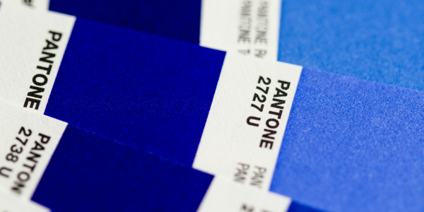
A rebrand changes the expression. Name, mark, color, typography, packaging, site. It’s justified when the identity actively misrepresents the business: the brand outgrew a DIY launch identity, merged, went premium, or carries baggage the market won’t forgive. Done on top of solid positioning, it’s powerful. Done instead of positioning, it’s redecorating the wrong house.
The failure mode has a name in our practice: the Cosmetic Rebrand. Growth stalls, the brand commissions a refresh, everything looks new, and a year later the numbers haven’t moved because nothing about the brand’s meaning changed. The tell is in the brief: when the stated goal is “look more premium” without an answer to “premium to whom, against what,” the project is cosmetic before it starts. We wrote about the upstream version of this in The #1 Mistake People Make Before a Rebrand.
The Diagnostic: Trace the Symptom, Not the Mood
Run the decision on evidence instead of restlessness. Four questions do most of the work:
1. Is the problem recognition or preference? If people don’t remember you, that can be an identity problem. If they remember you and still don’t choose you, that’s positioning, and no amount of visual polish fixes preference.
2. Are the wrong customers arriving? Price shoppers, bad-fit briefs, audiences you’ve outgrown. That’s the brand’s promise attracting the wrong people, which is a meaning problem. Reposition.
3. Does the identity embarrass the business? Put your brand next to the three competitors you lose to. If it genuinely looks like the discount option, identity work is on the table, after the positioning is confirmed sound.
4. What did the last change fix? If you’ve already refreshed the visuals once and the same problems persist, that’s the strongest evidence available that the problem was never visual.
The sequence matters more than the choice. Positioning before pretty: strategy first, expression second. When a repositioning genuinely outgrows the old identity, the rebrand follows naturally and the visual decisions practically make themselves, because there’s finally something specific to express. The reverse order, identity first and strategy never, is how brands spend five figures to stay stuck. It’s the same trap as branding too early in a company’s life, which we see constantly with founders who invest in expression before the position is settled.
What This Costs, Honestly
Repositioning is strategy work: research, decision-making, messaging, and rollout discipline. It’s measured in weeks and priced like senior thinking. A full rebrand is strategy work plus an identity system plus implementation across every touchpoint, which is why it runs multiples of a repositioning. Paying rebrand money to solve a repositioning problem is the single most common budget mistake we see in brand work, and it’s fully avoidable with one honest diagnostic up front. If you’re weighing the decision against a bigger growth picture, How to Future-Proof Your Brand is useful context on which brand investments compound.
Most owners eventually figure out which project they needed. The expensive part is the order they find out in. The ones who diagnose before they design consistently spend less and move faster, and the diagnosis itself takes a fraction of the time the wrong project would.
This exact decision, reposition or rebrand and in what order, is what the Brand Jump exists to answer: a structured diagnostic that tells you what’s actually broken before you commit real budget to fixing the wrong thing. If you’re staring at this fork right now, start there.