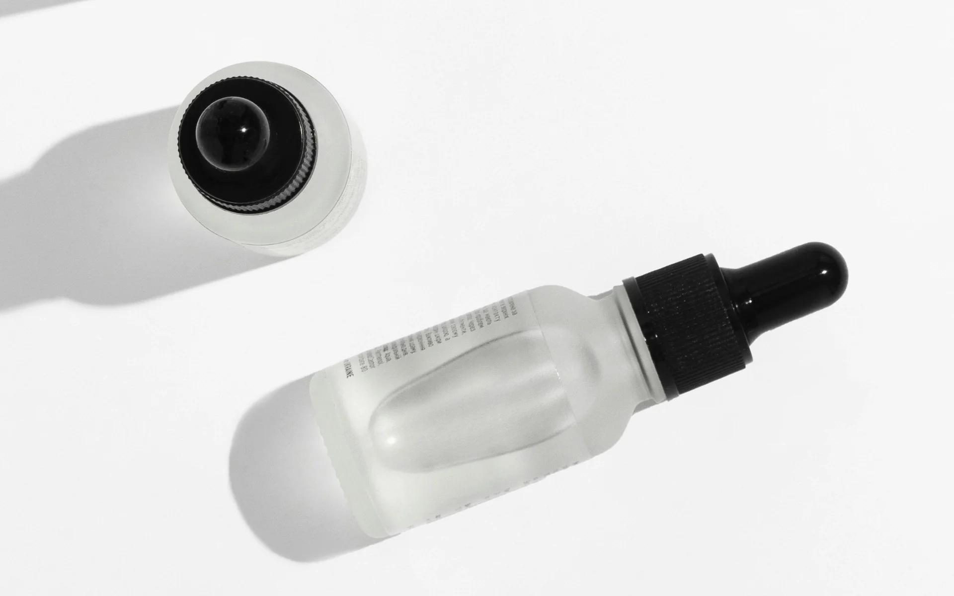
Picture two serums that both promise to make your skin look younger. Same hero ingredient, more or less the same price, both in a little glass dropper bottle. One of them you’d happily leave out on the counter where people can see it. The other you’d quietly tuck in the cabinet, even though it does the exact same thing. Nothing in the bottle explains the difference. It’s everything around it.
That second serum is the brand I get asked about constantly. The product is genuinely good, the packaging is perfectly nice, and it still somehow reads as forgettable. “So why doesn’t it feel premium?” And the honest answer is usually that nothing’s wrong, exactly. It’s just that fine and premium aren’t the same thing, and a lot of brands settle at fine without realizing there’s more on the table.
Quick version: A premium feel comes from doing less, on purpose. Brands read as premium when they’re specific, restrained, and consistent enough that every little thing feels deliberate. Fine is a brand doing a lot of things acceptably. Premium is a brand doing a few things with real conviction.
Premium is built by leaving things out
The instinct, when a brand feels flat, is to add. More messaging, more colors, more content, another font because the first one felt a little boring. And it almost always makes things worse, because every addition is one more thing competing for attention and one more chance for the brand to look unsure of itself.
Premium brands tend to do the opposite and cut. One typeface used really well instead of three fighting each other, a tighter color story, fewer claims said with more conviction. The restraint itself is part of what reads as expensive, because restraint is hard and on some level we all know it. When everything is turned up nothing feels chosen, whereas a brand that holds back looks like it knows exactly what it is.
Specific is what reads as expensive
The other big one is specificity. Vague is honestly the most expensive mistake a brand can make, because vague reads as cheap even when the product is excellent. “Clinically advanced formula” is vague. “1% encapsulated retinal, buffered so it won’t wreck sensitive skin” is specific, and the specific version is the one that makes you believe the price.
It shows up everywhere once you start noticing it. The serum that promises “radiant, youthful skin” versus the one that tells you the exact active, the percentage, and who it’s actually for. Specifics are proof. They tell a buyer you really know the thing you made, and that quiet confidence is a big part of what feels premium.
Consistency is most of the job
Here’s the part that’s almost boring, which is probably why it gets skipped: consistency carries more of the premium feel than any single beautiful asset does. A brand reads as high-end when the website, the packaging, the email, the unboxing, and the Instagram grid all feel like the same hand made them. One wobble and the spell breaks, the gorgeous site with the afterthought confirmation email, the elevated box with the chaotic feed.
It’s why I tend to think about this as a system rather than a pile of deliverables. Any one piece can be lovely on its own and still add up to “fine” if the pieces don’t agree with each other. The brands that feel genuinely premium usually aren’t doing something magical on every touchpoint. They’re just not contradicting themselves anywhere.
What’s quietly keeping you at fine
Most of what holds a good brand at fine is small, which is exactly why it survives. A few of the usual suspects: too many fonts, or one font doing a job it was never built for. Stock photos a customer has already seen on ten other sites, which people clock faster than you’d think. Copy that hedges, because “we believe in maybe helping you possibly feel a bit better” reads as unsure, and unsure never feels premium. Spreading yourself across every platform with the same flat energy instead of being genuinely good somewhere specific.
None of these are disasters. They’re just small enough to ignore and, all together, more than enough to keep a brand feeling ordinary.
How to actually move from fine to premium
If you want the shift, it’s less about a redesign and more about a handful of small, opinionated decisions. Pick the one thing you want the brand to be known for, and let it run everything. Cut what doesn’t serve it, even the parts you’re a little attached to. Get specific everywhere you were playing it safe. And then make all of it agree with itself, top to bottom, so a customer gets the same feeling whether they meet you on a shelf, on the site, or in their inbox.
That’s taste working as a strategy instead of a finishing touch, and it’s the difference between a brand people compliment and a brand people actually choose. Rhode is a good example of restraint doing the heavy lifting while a lot of celebrity brands tried to do everything and faded. And it shows up the second someone holds your product, which is why packaging is so often where the premium feel is won or lost.
The part most founders don’t expect is how much lighter it feels on the other side. Once you’ve decided what the brand is and isn’t, you stop second-guessing every little choice, because most of them are already answered.
If your brand is sitting at fine and you can feel there’s a level it isn’t reaching, that’s usually worth a real look before you spend on a redesign. It’s what a Brand Jump is for, finding the specific places a brand is being safe instead of being itself. If you’d want a second set of eyes on yours, I’d genuinely love that.
So go back to those two serums for a second. Same hero ingredient, same price, same little dropper bottle, same promise to turn back the clock. The only thing that really separated them was that one decided exactly what it was and let you feel that everywhere, while the other just hoped the bottle would do the talking. Premium was never the bottle. It was knowing what you are, and having the restraint to let that be enough.